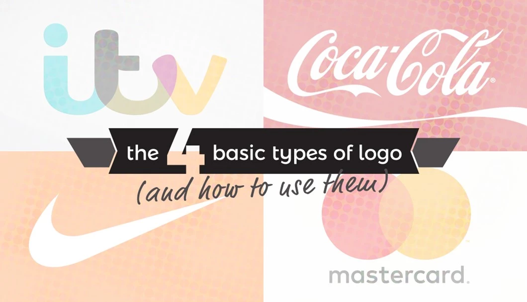
1. Lettermark
A lettermark logo is typography based and exclusively made up of a company or brand’s initials, and for that reason, it’s also known as a monogram. Examples include NASA, IBM, CNN… you get the idea!

If your company’s name is a mouthful, you should definitely consider using a lettermark. Would you really put up with saying “British Broadcasting Corporation” every time you mentioned a TV channel or Radio station? Because they are often comprised of a limited amount of characters, lettermarks are always clear and legible, even when scaled down on mobile or a business card. It’s always nice when the monogram spells a relevant word, too!
The main drawback of using a lettermark is that if you are creating an original brand, it can be difficult to create something distinctive, and people can often be left guessing what the company actually does or what they stand for (literally and metaphorically). In this case, it always helps to consider a combination mark (see number 3) or just include the full business name somewhere below for reinforcement.
2. Wordmark
As you may have guessed, wordmarks are typography based and usually focus on the name of the business or brand. This is often the simplest approach, which is why a lot of well-known companies have opted for wordmarks – Google, Facebook, Coca-Cola, Disney to name a few.

Wordmarks can be a really effective way of making your logo clear and legible, especially if you have a distinctive or original business name. Typographical choices are very important in the absence of any pictoral elements, so make sure you pick something which represents your company accurately. If you’ve picked Comic Sans, you might want to think again…
If you’ve got a really really long company name, see logo type number 1. Wordmarks aren’t for you!
3. Brandmark
In contrast to the first two types of logo, a brandmark (also known as a pictoral mark) abandons text completely. Apple’s apple, Nike’s swoosh and Twitter’s bird are all examples of iconic brandmarks.

As the above examples demonstrate, for well-known international companies, a brandmark can be a good way of transcending language and making sure you are instantly recognisable all over the world. The best ones are simple, and thrive as app icons and profile images in a digital age. They are also often better (than typographical logos) at conveying the more abstract or emotional qualities of your company – images speak a thousand words!
If your company is lacking brand recognition, brandmarks marks are probably a bad idea. Your icon might look great and represent your company perfectly, but if nobody knows who it belongs to, it’s largely useless. Maybe you should make sure your pictoral mark is (at least sometimes) accompanied by some type, like your company’s name. There should be a name for that type of logo too, shouldn’t there?
4. Combination Mark
That’s better. Our final basic kind of logo uses a brandmark alongside a wordmark or lettermark. This is probably the most commonly used, and well-known examples include Adidas, Mastercard, and British Steel.

Arguably the best of both worlds, the combination mark offers the clarity of typography and the visual appeal of an icon. A good pictoral mark can reinforce or add value to an average wordmark, and a good brand name can add clarification to what might have been a confusing or meaningless brandmark. This makes combination marks ideal for new and established brands alike.
On the other hand, by combining type and a brandmark you necessarily create a larger and more complex logo. As a result, combination marks can often be difficult to apply across a suite of marketing materials – you probably wouldn’t use one as your profile picture on Facebook. This is where it helps if you can use the pictoral and typographical elements of your combination mark independently without losing too much meaning.


