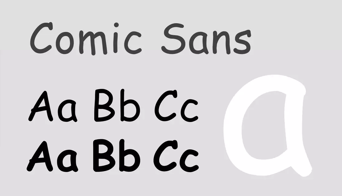
1 - Comic Sans
I may be a cliché for including this font, but unfortunately Comic Sans is still far more banal itself. Designed by Vincent Connare in the 90’s, Comic Sans was intended for a programme aimed at making computers more accessible to children. And the thing is, Comic Sans is a genuinely good choice when used in schools, as it is obviously more interesting to look at than your average sans serif, and is extremely legible (due to the single-leger “a” amongst other reasons). There have also been many unverified claims that Comic Sans is easy to read for dyslexic people. However, in a business environment it is inconceivable that this font could be perceived as being professional or sincere in the slightest. I have seen Comic Sans used far too often in corporate Powerpoint presentations, restaurant menus and even in the nameplate on a CEO’s door

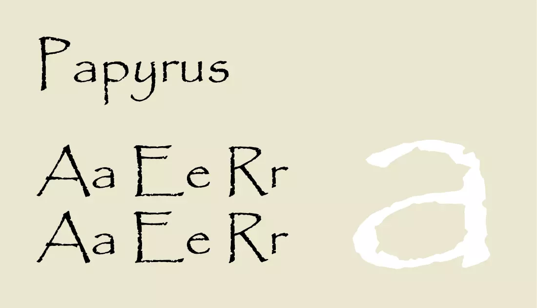
2 - Papyrus
Unlike Ryan Gosling’s character in an SNL skit about the Avatar logo, a hatred of Papyrus doesn’t quite cause me to lose any sleep. But it does demonstrate how overused Papyrus is considering just how niche it is. Made to look like it has been written in ink and quill on old parchment, I can’t think of one appropriate use for this font outside of creating a display on Ancient Egypt in a primary school. Somehow though, Papyrus is everywhere! As pointed out by Gosling, this is the go-to font for ‘Shakira merch’, ‘off-brand teas’ and indeed one of the biggest blockbuster movies in history.

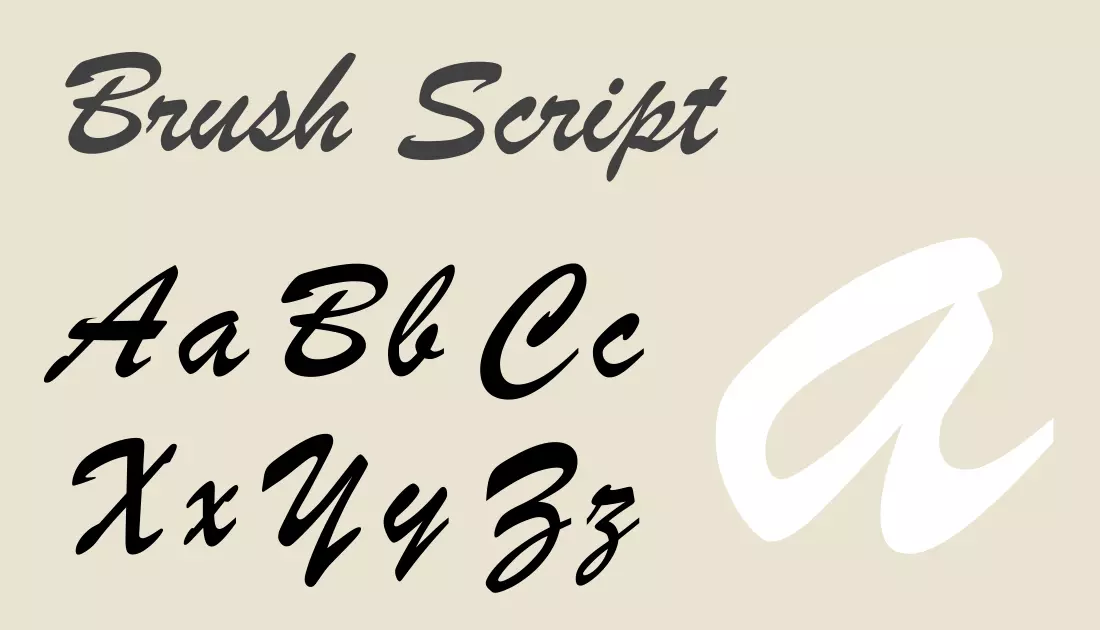
3 - Brush Script
As a designer, there are many occasions when the need arises to use a font which has the appearance of being written by hand. Script and handwritten fonts can offer a personal feel and fit extremely well into relatively recent design trends such as vintage or ‘village fete’ styles. “Brush Script” has been arguably the most used handwritten font, since it was created in 1942 by Robert E. Smith for the American Type Founders, probably alongside Bradley’s Hand. Unfortunately, on top of being extremely difficult to read as a result of the italicisation, Brush Script looks absolutely nothing like any person’s handwriting I have ever seen. The ascenders on the ‘h’, ‘t’ and ‘l’ are far too consistent, as are the variable widths of the strokes. With so many other more realistic handwritten fonts on the market or the ability to scan in custom lettering, why would you ever need Brush Script?


