
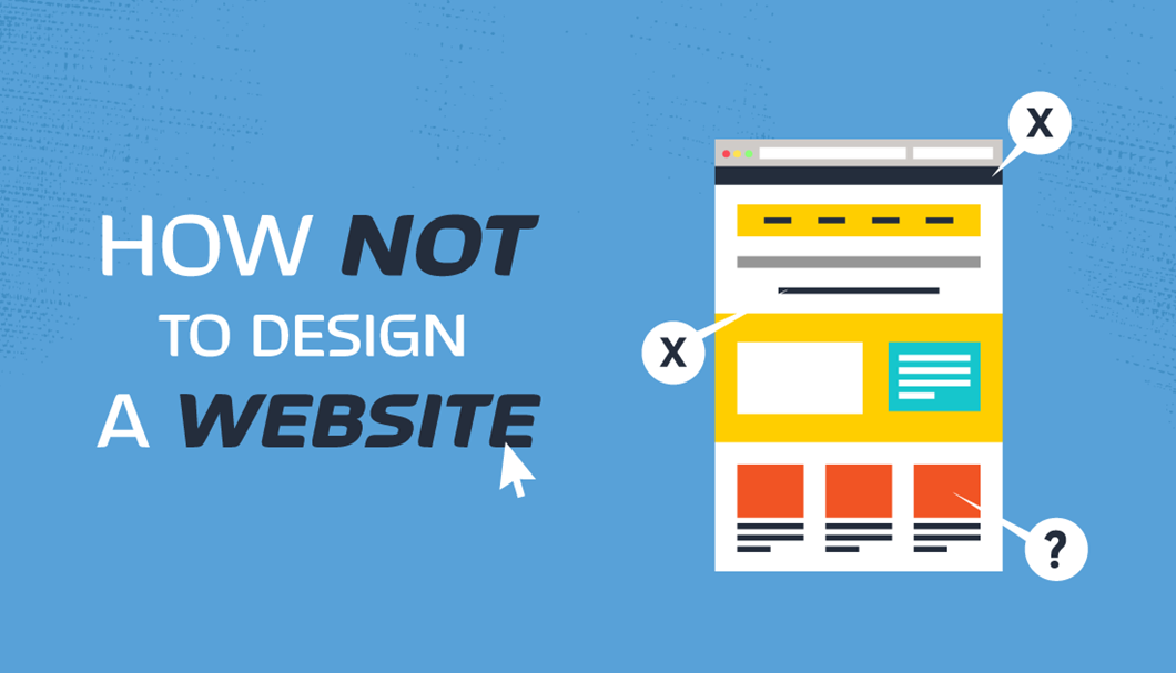
Let’s start with the first common mistake on Websites: Fonts!
The first problem that occurs when designing a website is the font being utilised. There are many factors on why a font could be the wrong type and could be from the following;
- Brand Consistency – Is the font being used not part of the Brand Guidelines? If so, there’s no consistency throughout the brand. It’s important to keep it all inside the guidelines, otherwise it won’t portray professionalism to the audience.
- Sizing – It’s the question a lot of us don’t dare to know the result of. Does SIZE really matter? On this occasion, yes it does! A lot of the older styled websites had a standard text size of 12px, but if you’re using a screen of 24 inches, the 12px might be a bit difficult to read.

The second common mistake on websites are: Low contrast fonts!
The second problem which commonly occurs when designing a website are the low contrast of coloured fonts on the site. This means that a lighter font on a light background or even a darker font on a darker background is extremely difficult to read.
There was an interesting article back in 2011 from Smashing Magazine that listed some interesting facts about reading. At the age of 40, only half the light gets through to the retina as it did at age 20. While for 60-year olds, it’s just about 20%.

The 3rd and final common mistake on Websites is…pointless call to actions!
While call to actions are an important factor for generating a user journey throughout the website, it’s also very important that the journey generates a conversion on the back of it. It’s great sending users to different parts of the website, but is it relevant? Is it generating conversion on the back of it? Probably not.
Keep it simple, get inside the users’ shoes and find out if the information being shown is needed. There’s no point having a call to action asking to sign-up to an event, if there’s then another call to action taking about something irrelevant to that event.

Summary
Designing a website has many important factors to consider for the end user, whether that’s considering the user journey or the user experience when accessing specific elements on the website.