History of the Channel 5 Brand Identity
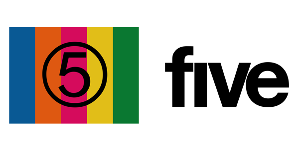
Starting from the beginning of the brand, the very first logo was designed by Wolff Olins and Saatchi & Saatchi in 1997. Consisting of a circled number five on a multi-coloured background which was designed to look like on-air. (Coloured bars used in a test patterns, often used when no program material was available).

In 2002, the channel re-launched and became known as ‘five’. Led by Trevor Beattie at TBWA London and featuring a word-play type logo, the logo incorporated a bulky styled font in black, giving it an aggressive feel and making it stand out.
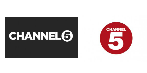
A subsequent uppercase logo - designed by London-based DixonBaxi - featured a rounded background and uppercase font. Although this still didn’t reflect the channel itself, they reintroduced colour, with a red circle and added the gradient / shadows.

In 2011, Richard Desmond - owner of Express Newspaper - bought the channel and re-launched it as Channel 5, bringing a brand new logo. This logo illustrated both type-faced elements ‘Channel’ while the circled-five was a combined combination from previous designs.

Channel 5 was later sold to Viacom in 2014, who actually promised a double digit budget growth for new programming and, yet again, planned to launch a comprehensive rebrand. This logo resulted to bringing out the colour and combining all elements of previous logos into one.
The New Channel 5 Logo
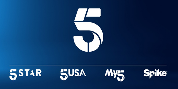
The rebrand that launched on the 4th February for Channel 5 included a brand new logo that included on-screen treatments for each of Channel 5’s channels: Channel 5, 5USA and 5Star, and was designed by New York Agency called Gretel.
The brand new logo can be seen as five individual segments. Different colours and textures can be added to reflect different moods and types of content. It also gives more flexibility: the 5 can be animated, making it more contemporary than the old corporate lettering.

Channel 5 has a colour palette made up of eight graduations, spanning pink, purple, green, blue and orange which will speak to viewers with a warm and friendly tone with opening and closing messages set in the light-weight typeface called ‘Nobel Light’.
Have Channel 5 finally settled down with a brand identity that’ll last? Compared to other competitors such as Channel 4, Channel 5 have rebranded many times over the last decade. Channel 4 has taken the gradual approach - altering their brand identity from 1999 into a 3D object form, then turning away from 3D into a flat image following the recent social trends of brand identity.
Overall, our thoughts are that the rebrand is creatively designed and thought process has been put into the hard work that’s took place, even though it took 13 months to critique the design. The font was a positive and good call, as it shows the brand has evolved rather than sticking with its bold boring fonts.


