

Sections
Introduction
So surely it is important that a business optimises their site’s layout and content to bring new users in and keep them browsing the site for as long as possible. Unfortunately, a lot of businesses aren’t aware of this fact, whether it’s due to a low marketing budget or they are just old-fashioned.
Due to this, I will be covering statistics on why having an attractive website is important along with some tips & tricks to help you improve your site today.
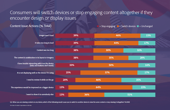
After all, 38% will immediately stop engaging with your site if the content is unattractive in its layout or imagery.
Part 1: Brand Guidelines
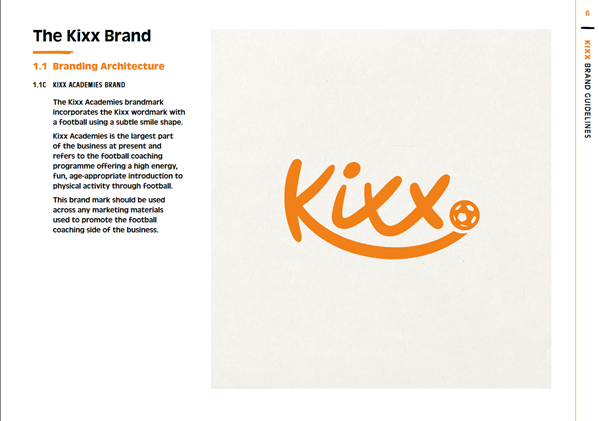
The first step for any company to have an attractive, well-formatted site is to follow a brand guideline to keep consistency throughout the site. To show an example we will be using a brand guideline we have written for a football academy called Kixx.
A successful brand guideline will cover where the brand’s logo should be used and it should also break down the meaning behind a logo. So if we were to look at the Kixx brand guideline, we can see that the Academies brandmark represents the football coaching they offer.
A Brand Guideline should also provide information on brand values, key aims and the strapline too. This is something we also covered in the Kixx brand guideline. These key pieces of information are usually missed out when someone makes a brand guideline.
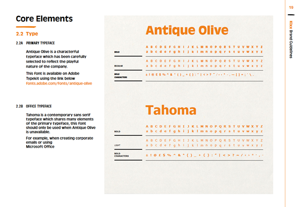
Another thing a brand guideline should include is core elements of the brand, this section includes what you can and can’t do with the brand’s imagery and fonts/colours used.
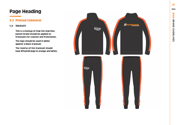
The final thing a brand guideline should include is Brand Application. This displays the physical uses of the brand. Whether that be on clothing, vehicles, or stickers. In this part, you should attach plenty of images in order to visualise the use of the brand as much as possible.
Part 2: Planning
It is no joke when we say, the best way to create an attractive site is to plan and plan a lot. If you have software such as Adobe XD it is all the better as XD offers a platform for web and app developers to visualise a website before they make the jump of creating a site.
Start with a blueprint, this is called a wireframe and it is meant to plan where the content areas will be and where buttons and such will end up. If you can effectively create a wireframe to create a non-congested webpage, then you can move on to the next step.
The next step would be to add colour to the wireframe, this is where you refer to your brand guidelines to incorporate the right imagery and colours, whether that be via RGB values or a hex code.
After this, all you have left is to add content once again referring to your brand guideline in order to remain consistent with your tone of voice.
Part 3: Mobile Optimisation
To start with the basics, let’s talk about mobile optimisation. Since the Google Mobilegeddon update in 2015, there has been a huge stress on making a website optimised to display on mobile. Since Google follows a strict mobile-first indexing procedure, many developers and SEO experts have grouped up to fix websites which are not optimised for mobile. This is because google penalises sites that aren’t mobile optimised by not indexing them.
Although this is typically done through some fancy CSS styling, new technology has evolved to make this process easier. For example, In 2016 Google invented a new technology called AMP (Accelerated Mobile Pages) so websites can load faster on Mobile Devices. AMP works by stripping a page down to its most essential parts and storing a cached version on Google servers, this allows a company to deliver content almost immediately.
This also comes with more benefits which result in a nicer-looking site when you are viewing on mobile.
This technology has become incredibly useful, especially considering that people typically use 2 devices simultaneously. This technology allows a website to adapt its structure depending on the type of device used.
Something else which helps with mobile optimisation is the Image format used. We are out of the age where jpeg is the standard and newer and faster image formats are being supported on major browsers like Google and Safari, so why not use them?
At the end of the day, if a mobile user can reach your site faster then surely it’s a better alternative.
In Summary
To Summarize, if you keep the theme of your site consistent throughout and ensure that your site can be comfortably viewed from any device then you will retain any new users who visit your site.