

…in at Number 5, Electrolux
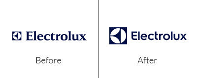
Let’s face it, the old logo really did need updating and a move away from the dated Serif fonts is certainly a step in the right direction.
…in at Number 4, The Royal Albert Hall
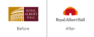
Well, this is definitely a rebrand with a difference. The new logo conveys such a modern feel when used in full colour with gold to burgundy overlays. Overall the abstract, shaped pictorial mark perfectly depicts the façade of the Royal Albert Hall.
…in at Number 3, Logitech
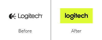
Logitech doesn’t just do mice or webcams anymore. They needed a logo that looked sleek, bright, clean and modern to compliment the new range of products. Gone is the old logo that either represented a Bear’s Paw or Webcam for good.
The simplistic mono wordmark is used with a striking palette of colours that evoke a youthful trendy feel. These cheeky colours and a detached curve that forms the loop of the letter ‘g’ resembling a grin, bring a smile to your face.
…in at Number 2, Spotify

In an effort to ditch the outdated gradients of the broccoli colour palette, Spotify announced at the SXSW music conference and festival in March that the brand was to alter.
By June, the new brand was launched. Adopting a slightly lighter solid green that looked more positive against the oily blue background rather than the previous on black.
Let’s face it - the original colour muddy-coloured green was chosen seven years ago, just because it was totally different to all the other Social Media colours at the time. While this new logo caused outrage among many, I love it!
…at Number 1, it has to be Lexmark
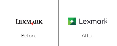
In keeping with the green theme, Lexmark rebranded around the same time this year as Spotify. Probably one of my favourites rebrands at the moment, not for the colour but the negative space that is made from the precise angles of the aperture to form the traditional Lexmark diamond.
Another aspect of the logo is the fact they have rotated the letter ‘x’ which perfectly compliments the rest of the letters. Overall, it looks modern, dynamic and the use of a green palette evokes a fresh, vibrant and sustainable feel.