Crown Estates are an established Yorkshire Estate Agents, who have been operating for over 25 years.

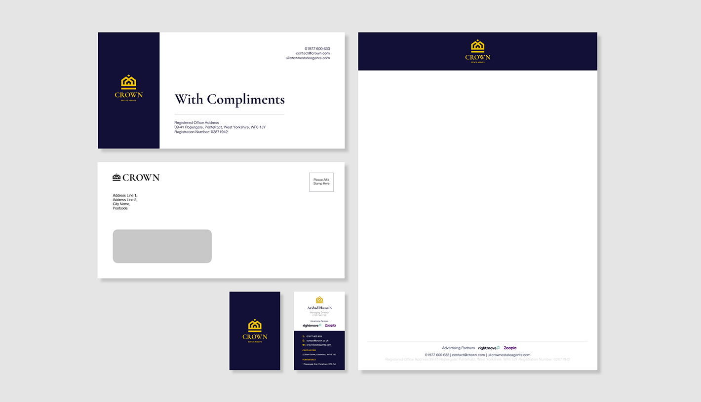
We were approached by Crown Estates to refine their brand as a result of joining of AON and Crown Estates to one entity. As Crown Estates is well established within the local areas, the client wanted to maintain the original integrity and heritage of the brand whilst incorporating elements to reflect the merging of two businesses. It was also important that the new brand would be easily applied throughout Crown's marketing collateral.
A strong and recognisable brand is one of the most valuable assets your business can have.
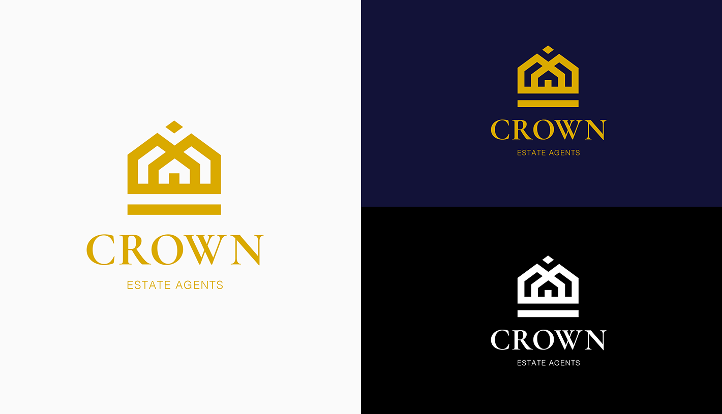
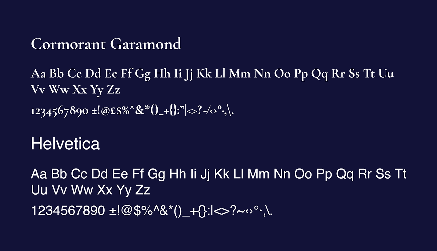
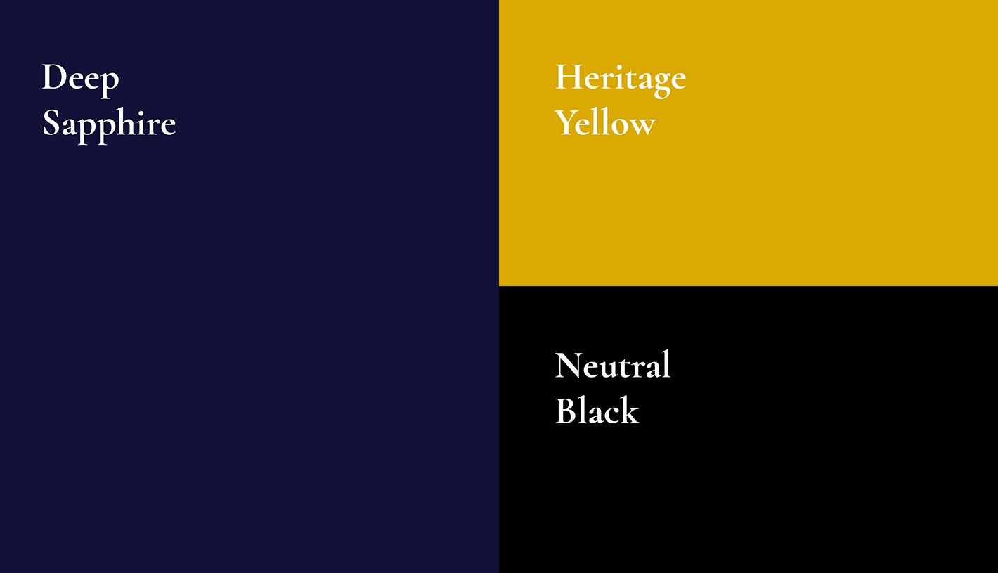
The new brand identity is focused on visualising the partnership between AON lettings and Crown. This marque was constructed by combining the visual elements from previous logos: the house from AON lettings and crown from Crown Estate Agents. The mark subtly hints towards the partnership between two background elements joining in the middle to create a house. We also produced a comprehensive brand pack to ensure any marketing collateral is consistently created.
We delivered a brand to the client which will stand the test of the time. We have created all the marketing collateral the client needs to roll out their brand effectively, and have had fantastic initial feedback from the client.