Brave Colour Palettes
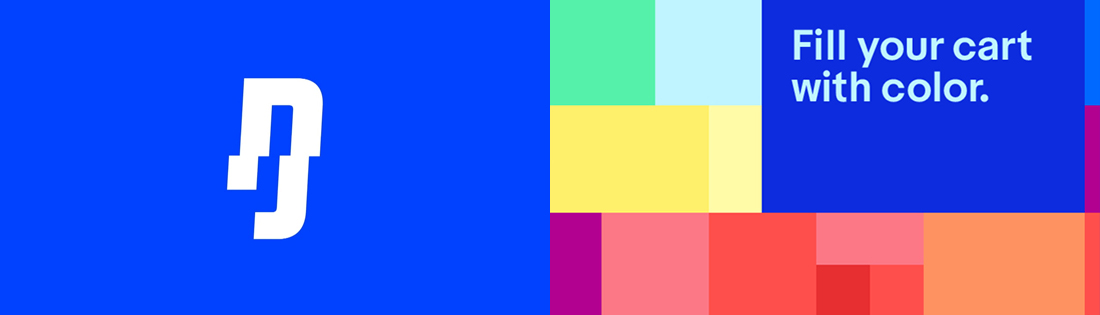
The last year has seen brands move away from previously favoured pastel hues and increasingly adopt bright and bold swatches. This began with that extremely bright blue colour seen in many identities such as “Race Against Dementia”, but more recently big brands such as Spotify and eBay have made use of several extremely strong colours as part of the same palette. Get your sunglasses ready for 2018.
Semi-Flat Design
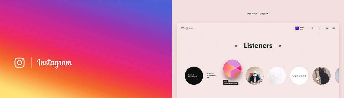
For a long time, flat has been king of the design world. This all changed when in 2016, Instagram broke the mould with a complex gradient as a prominent feature in their logo and branding. However, their identity was uncomplicated and had undeniable character – the gradient alone is now synonymous with Instagram. As a result, designers seem to be finding ways of injecting 3 dimensional elements into brands in subtle ways. The new “semi-flat” includes gradients (or “colour transitions”) and even drop shadows.
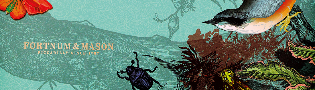
Custom Illustration
Stock photos and vectors are now more accessible than ever before, and are sometimes even free. For leading brands though, custom illustrations have become an important part of their identity. Fortnum & Mason’s illustrations for their packaging design have received critical acclaim in the creative community. This is a great example of meaningful design which would have been much less powerful if the creative team had settled for using generic stock elements.
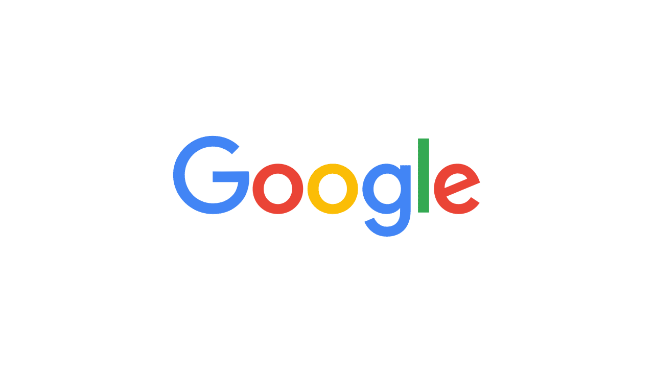
Logo Animations & Microanimations
Google’s rebrand in 2015 received an overwhelming amount of attention, in particular the animated versions of the logo. Ever since, designers have been finding ways of adding elements of movement and interactivity into brands. This includes “parallax scrolling” effects and “particle backgrounds” on websites which are also becoming ever more possible thanks to developments in CSS and internet speeds.
Nostalgia
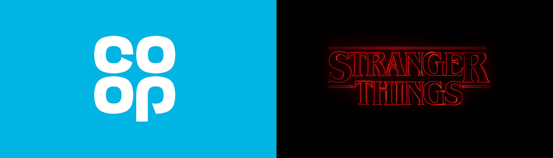
Melancholy has become a powerful tool in many creative industries – look no further than the success of Stranger Things, which drew inspiration from almost every 1980s film stereotype available. Brands such as the Co-op and Natwest have thrown back to historic versions of their logo in recent rebrands. The Co-op’s revived “clover leaf” has received a great response from both the design community and the general public alike.